An accordion web component is a handy UI component that allows users to show and hide blocks of content with the click of a button.
It is often used for FAQs, display long comments, and break up any lengthy content into easy bites.
What is an Accordion?
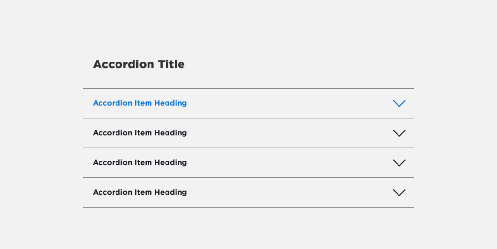
An accordion lets users expand and collapse content blocks to show more details without taking up too much screen space.
This is better than displaying all of the information at once, which can look cluttered. Accordions neatly organize chunks of more detailed content under descriptive headings. They are commonly used for:
- FAQ pages
- Displaying customer comments
- Breaking up long posts into digestible parts
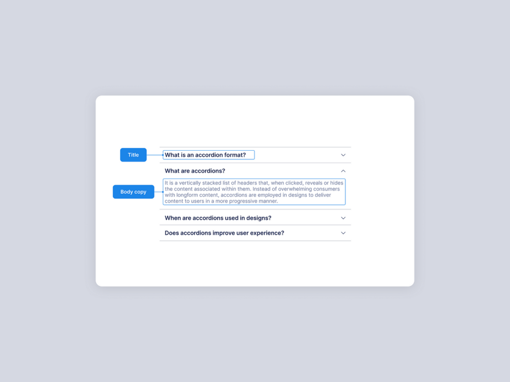
Each section of an accordion is known as an accordion item. Clicking on an item’s header will expand or collapse the item’s content panel.
Here are the key parts:
- Header: The button with descriptive category users click to show or hide item.
- Content: The details that are revealed or hidden when header is clicked.
- Chevron icon: A small arrow that flips to show state of content.
With HTML, CSS, and JavaScript, you can make custom accordions for any project.
Make a Basic Accordion with HTML
Here is how to assemble the key pieces of an accordion with HTML markup:
- Base container div: Enclose accordion in a <div> for base styling.
- Item containers: Each item in a <div> labeled with item.
- Headers: Headings to click and toggle content in <h3> tags.
- Contents: Paragraphs with details in <div> set to hidden with display: none;
This markup alone will build out the structure of an accordion.
Here are some key details on HTML structure:
| Item | Details |
| Container | Outer <div> to enclose all parts |
| Individual items | Each in a <div> with item class |
| Header button | Clickable <h3> heading in each item |
| Hidden content | Paragraph in <div> is set hidden |
Now we can style our accordion to match any design.
How to Style Accordion with CSS?
With Cascading Style Sheets (CSS), you can control colours, spacing, fonts, and other visuals. Here are the main properties to customize your accordion’s looks:
- Base styles for overall component
- Header styles for button look
- Chevron icons and effects
- Content styles for detail panels
1. Base Styles
The outer container <div> has “base styles” that cascade to inner items:
.accordion {
background: #f4f4f4;
border-radius: 25px;
padding: 15px;
}
Setting a light gray background, curved corners, and spacing.
2. Header Styles
The header <h3> buttons can be styled:
.accordion h3 {
background: #d2601a;
color: #fff;
padding: 0px 20px;
border-radius: 5px;
}
Changing colors, padding, and corner shape.
3. Chevron Icons
An “::after” pseudo element generates the chevron icon:
.accordion h3::after {
content: “\002B”;
color: #fff;
font-weight: bold;
float: right;
}
This “plus” symbol item represents opening or closing. We later “minus” when open.
4. Content Styles
Panel <div> changes for open items:
.accordion p {
color: #696969;
line-height: 1.5em;
}
And that styles our basic accordion! The pieces come together in this CodePen:
To recap, making things bold, italic, divided into lists, and formatting tables helps highlight key parts for readers.
We’ve covered everyday terms and simplified concepts into easy segments.
Add Animated Transitions with CSS
For a smooth and modern accordion, animated transitions transform the opening and closing effects. This is achieved with additional CSS properties.
Example animation settings:
.accordion p {
max-height: 0;
overflow: hidden;
transition: max-height 0.5s ease;
}
- Content height starts at 0 to hide it
- Overflow is hidden
- Transition time is half a second
Now expansions slide down and closings slide up smoothly!
Many visually pleasing effects can be mixed and matched:
| Effect | Property | Value |
| Slide down | max-height | 0.5s ease |
| Fade in | opacity | 0s 1s ease |
| Grow | transform | scale(1) |
Breaking down the table, we see transitions slide content down, fade it in slowly, or even scale items up.
Customize with:
- Timings
- Effects like opacity and transforms
- Cubic bezier curve presets like ease
This empowers you to craft an interface with personality!

Toggle Items Open and Shut with JavaScript
While HTML and CSS render an accordion’s base structure and looks, JavaScript programming language adds interactivity. Now we will make headers toggle between open and closed on click.
We select all parts:
const accordion = document.getElementsByClassName(‘accordion’);
Then a click event listener:
accordion.addEventListener(‘click’, function(){
// Toggle open or close
});
The logic says:
If clicked item is closed > open it
If clicked item is open > close it
We check with a class toggle:
this.classList.toggle(‘active’)
Let’s Recap
We broke down how to make a custom accordion step-by-step:
- HTML structure
- CSS visual styling
- Animations for smooth interactions
- JavaScript programming for interactivity
Accordions elegantly showcase and hide additional content – keeping things tidy while allowing users to reveal more details.
You now have the frameworks to craft beautiful accordions that enhance your web interfaces!


